| 일 | 월 | 화 | 수 | 목 | 금 | 토 |
|---|---|---|---|---|---|---|
| 1 | 2 | 3 | 4 | |||
| 5 | 6 | 7 | 8 | 9 | 10 | 11 |
| 12 | 13 | 14 | 15 | 16 | 17 | 18 |
| 19 | 20 | 21 | 22 | 23 | 24 | 25 |
| 26 | 27 | 28 | 29 | 30 | 31 |
- 자바스크립트 이벤트 루프
- Linux cat
- EC2 HTTP 호스팅
- Logback
- Linux rmdir
- Linux oh my zsh
- linux background
- AWS EC2 서버 만들기
- HTTP Web Server
- Linux cd
- EC2 zsh
- Linux 파일 관리 명령어
- Linux mkdir
- Linux pwd
- EC2 Apache2
- Navigation Pattern
- Linux 디렉터리 역할
- javascript scope
- Linux ls
- 자바스크립트 런타임
- javascript 정렬
- JavaScript 실행 디버깅
- Linux apt-get
- Linux 디렉터리 구조
- JavaScript EventLoop
- Linux apt
- 서버의 서비스 방식
- linux foreground
- Linux 디렉터리 명령어
- EC2 oh my zsh
- Today
- Total
HyunJun 기술 블로그
CSS Grid 본문
1. CSS grid
Flex와 마찬가지로 레이아웃을 잡기 위해 사용된다. Flex와의 다른 점은 Flex는 한 가지 방향으로만 레이아웃 설정이 가능한 1차원적인 시스템이고, Grid는 두 방향(가로-세로)으로 레이아웃 설정이 가능한 2차원적인 시스템이다.
1) Container와 Item
Flex와 마찬가지로 Grid를 적용하려는 전체 공간을 Grid Container(부모 요소)라고 부르고, 각각의 배치하는 아이템들을 Grid Item(자식 요소들)이라고 부른다.
<div class="container">
  <div class="item">1</div>
  <div class="item">2</div>
  <div class="item">3</div>
  <div class="item">4</div>
  <div class="item">5</div>
  <div class="item">6</div>
  <div class="item">7</div>
  <div class="item">8</div>
  <div class="item">9</div>
</div>
Flex와 마찬가지로 display: grid를 컨테이너에 적용시킴으로써, grid의 영향을 받는 공간이라는 것을 명시해 준다.
.container {
  display: grid;
}
Flex와 마찬가지로 컨테이너에 적용하는 속성과, 아이템들에게 적용하는 속성으로 나뉜다.
2. container에 적용하는 속성
1) display: grid;
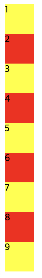
flex와 다르게 display: grid;를 넣어주어도 당장에는 큰 변화가 없다.
.container {
  display: grid;
}

.item {
  width: 50px;
  height: 50px;
}

.item:nth-child(odd) {
  background-color: yellow;
}

.item:nth-child(even) {
  background-color: red;
}
2) 그리드의 형태 정의
- 컨테이너에 Grid 트랙의 크기들을 지정해 주는 속성이다. 여러 가지 단위를 사용할 수 있고 여러 가지 조합을 사용할 수 있다.
- row, column의 형태를 지정해 준다.
grid-template-columns
열(column)의 배치를 설정한다. 예를 들어, 아래와 같은 경우
.container {
  display: grid;
  grid-template-columns: 200px 300px 100px;
}- 첫 번째 column으로부터 200px 띄우고, 두 번째 column 위치 지정
- 두 번째 column으로부터 300px 띄우고, 세 번째 column 위치 지정
- 세 번째 column으로부터 100px를 띄운다가 된다.
- 네모 박스의 왼쪽 선 기준에서 px을 띄우는 것이다.
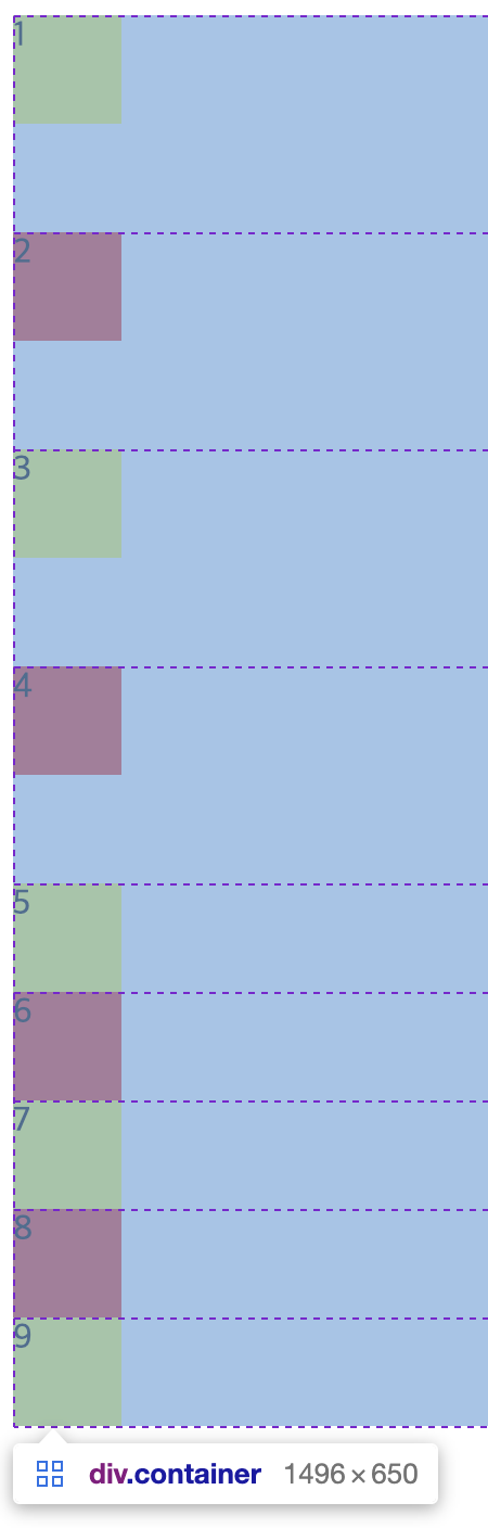
이해를 돕기 위해 만약 아래처럼 설정하면
.container {
  display: grid;
  grid-template-columns: 50px 50px 50px 50px 50px 50px;
}
아래와 같은 결과가 나온다.
grid-template-rows
grid-template-columns와 원리는 똑같다.
.container {
  display: grid;
  grid-template-rows: 100px 100px 100px 100px;
}
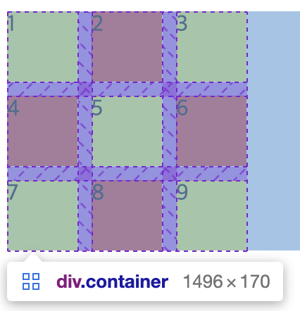
3) repeat()
grid-template-columns(rows) 사용 시 해당하는 px을 10번 혹은 그 이상 많이 써야 한다면 불편하지 않을까? 이것을 쉽게 해결할 수 있는 함수가 있다. 단순히 repeat(반복 횟수, 반복 값)으로 동작하지만 아래처럼 변화를 주어 사용도 가능하다.
.container {
  display: grid;
  grid-template-columns: repeat(2, 50px 100px 50px);
}
50px, 100px, 50px을 2번 반복한다. 즉 grid-template-columns: 50px 100px 50px 50px 100px 50px;와 같다.

그 외에도, minmax(), auto-fill, auto-fit 등을 활용할 수 있다.
4) 간격
column-gap
column들 간의 gap을 조정한다.
.container {
  display: grid;
  grid-template-columns: 50px 50px 50px;
  column-gap: 10px;
}
row-gap
row들 간의 gap을 조절한다.
.container {
  display: grid;

  grid-template-columns: 50px 50px 50px;
  row-gap: 10px;
}
gap
column, row gap을 같이 설정한다.
.container {
  display: grid;
  grid-template-columns: 50px 50px 50px;
  gap: 10px;
}
5) 그리드 형태 자동 정의
grid-template-columns(rows)가 적용되지 않은 트랙들을 자동으로 지정한다.
예를들어, 아래와 같은 경우
.container {
  display: grid;
  grid-template-columns: 50px 50px 50px;
  grid-auto-rows: 100px;
}
columns 설정 만으로 3x3 정사각형 형태가 나오지만, 설정상으로 grid-template-rows는 설정되어 있지 않기 때문에 grid-auto-rows: 100px은 grid-template-rows: 100px 100px 100px의 효과를 낸다.

예를 들어 아래와 같은 경우, 사실상 grid-auto-rows: 100px은 grid-template-rows가 명시적으로 적용되어 있기에 적용되지 않고 있다.
.container {
  display: grid;
  grid-template-columns: 50px 50px 50px;
  grid-template-rows: 50px 50px 50px;
  grid-auto-rows: 100px;
}
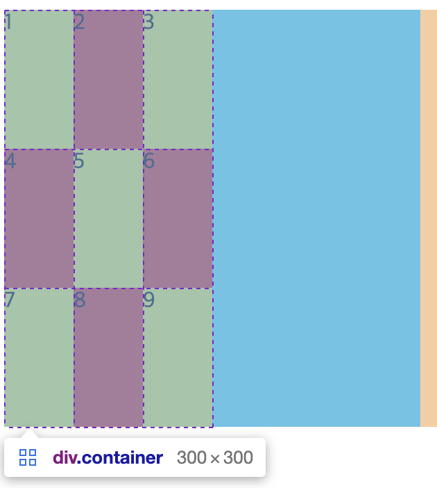
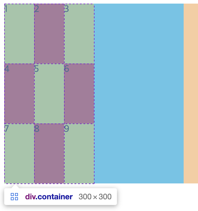
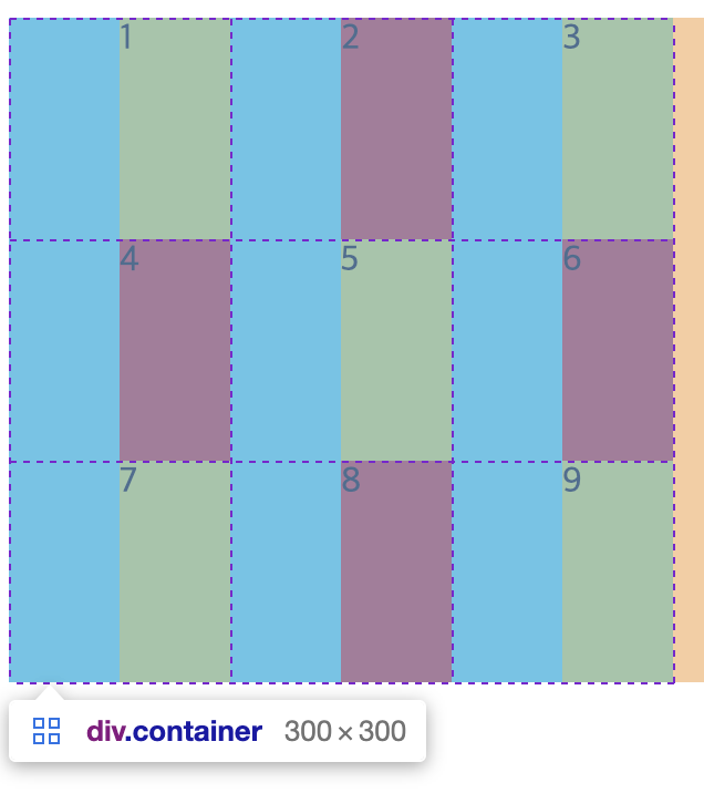
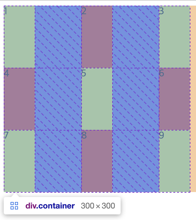
6) align-items
아이템들을 세로(column 축) 방향으로 정렬한다. stretch가 기본값이다.
.container {
  width: 300px;
  height: 300px;
  display: grid;
  grid-template-columns: 50px 50px 50px;
  background-color: aqua;
  align-items: stretch;
  /* align-items: start; */
  /* align-items: center; */
  /* align-items: end; */
}


.item {
  min-width: 50px;
  min-height: 50px;
}
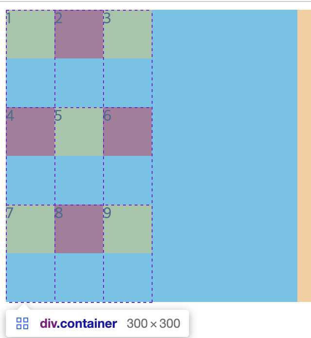
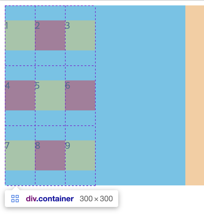
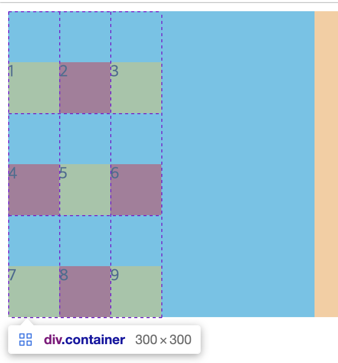
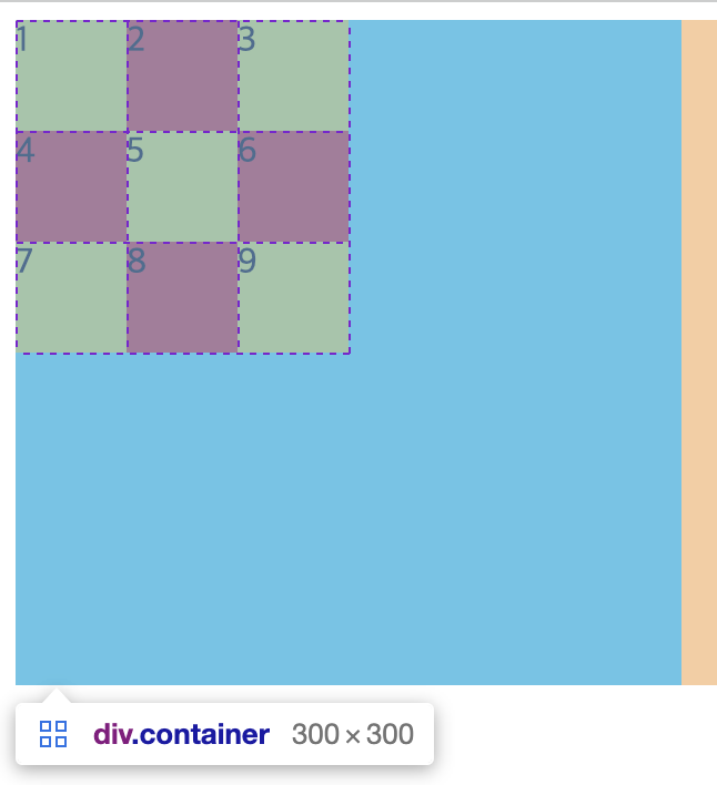
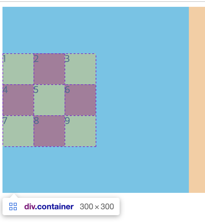
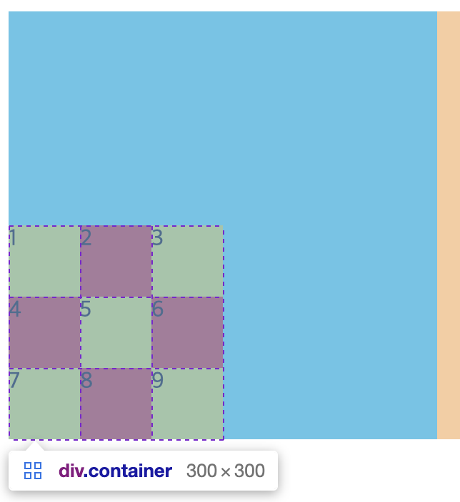
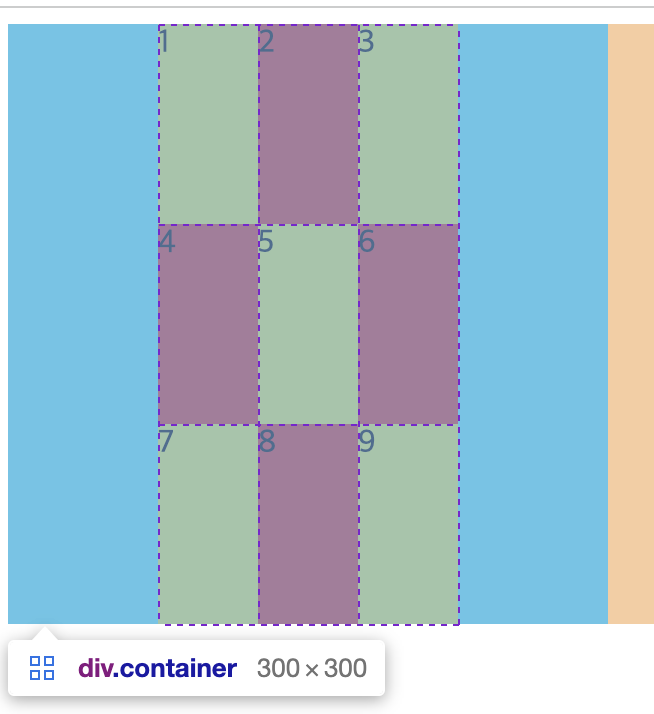
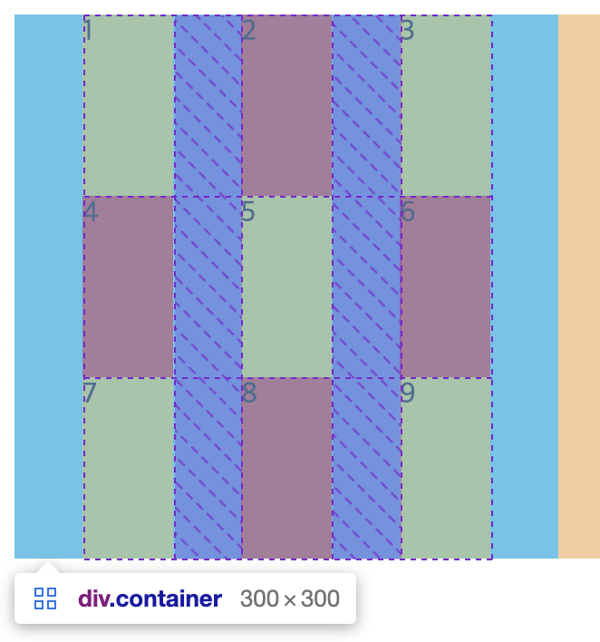
7) align-content
- Grid Item들의 높이를 모두 합한 값이 Grid Container의 높이보다 작을 때 Grid Item들을 통째로 정렬한다.
.container {
  width: 300px;
  height: 300px;
  display: grid;
  grid-template-columns: 50px 50px 50px;

  background-color: aqua;

  align-content: stretch;
  /* align-content: start; */
  /* align-content: center; */
  /* align-content: end; */
  /* align-content: space-between; */
  /* align-content: space-around; */
  /* align-content: space-evenly; */
}

.item {
  min-width: 50px;
  min-height: 50px;
}

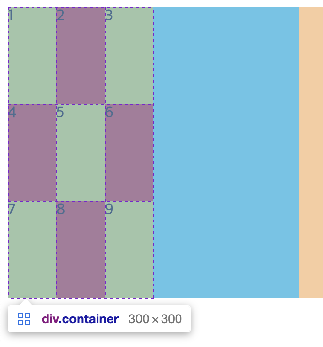
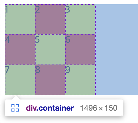
8) justify-items
아이템들을 가로(row 축) 방향으로 정렬한다.
.container {
  width: 300px;
  height: 300px;
  display: grid;
  grid-template-columns: 100px 100px 100px;

  background-color: aqua;
  justify-items: stretch;
  /* justify-items: start; */
  /* justify-items: center; */
  /* justify-items: end; */
}

.item {
  min-width: 50px;
  min-height: 50px;
}

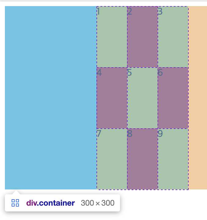
9) justify-content
- Grid Item들의 넓이를 모두 합한 값이 Grid Container의 넓이보다 작을 때 Grid Item들을 통째로 정렬한다.
.container {
  width: 300px;
  height: 300px;
  display: grid;
  grid-template-columns: 50px 50px 50px;

  background-color: aqua;

  justify-content: stretch;
  /* justify-content: start;
  justify-content: center;
  justify-content: end;
  justify-content: space-between;
  justify-content: space-around;
  justify-content: space-evenly; */
}

.item {
  min-width: 50px;
  min-height: 50px;
}


3. Item들에게 적용하는 속성
1) 각 셀의 영역 지정
각각의 grid item들에게 적용하는 속성으로, 각 셀의 영역을 지정한다.
영역에 따른 size 확인을 위해 최소 사이즈로 변경
.item {
  min-width: 50px;
  min-height: 50px;
}
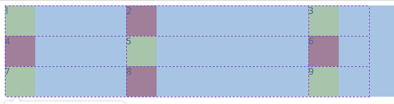
grid-column-start (grid-column-end)
column에 있어서 start와 end 만큼의 영역을 차지한다.
아래처럼 지정하는 경우
.container {
display: grid;
grid-template-columns: 50px 50px 50px;
}
.item {
min-width: 50px;
min-height: 50px;
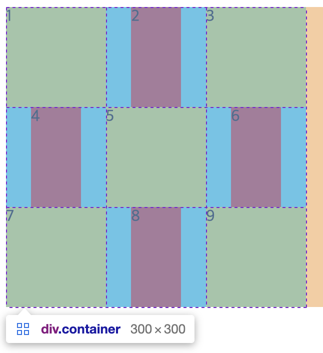
}
.item:nth-child(1) {
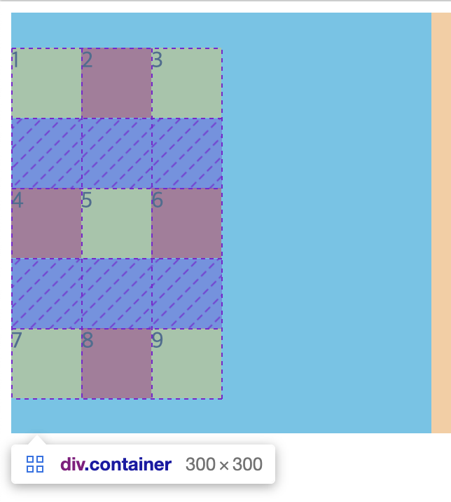
grid-column-start: 1;
grid-column-end: 2;
}변화는 없는데 그 이유는, column-start 1의 위치는 1번 박스의 왼쪽 세로 선이고, column-end 2의 위치는 1번 박스의 오른쪽 세로 선이기 때문에 현재 설정으로는 1칸만을 차지하는 설정이다.
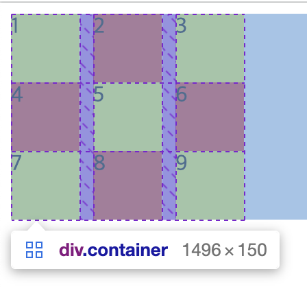
아래처럼 설정하면
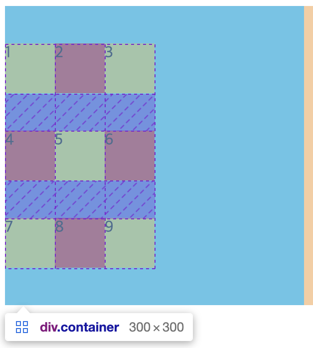
.item:nth-child(1) {
  grid-column-start: 1;
  grid-column-end: 4;
}
4번 박스 기준 왼쪽(위) 세로 선이 column-end 3지점이고 4번 박스 기준 오른쪽(위) 세로 선이 column-end 4지점이므로 3칸을 차지하게 된다. 아래 이미지 기준 맨 왼쪽 세로 선부터 1번으로 보면 된다.
grid-column
마지막 예제를 아래처럼 축약해서 설정할 수 있다.
.item:nth-child(1) {
  /*
  grid-column-start: 1;
  grid-column-end: 4;
  */

  grid-column: 1 / 4;
}
grid-row-start (grid-row-end)
row의 개념도 column과 방향(기준)만 다를 뿐 원리는 같다.
.item:nth-child(1) {
  grid-column-start: 1;
  grid-column-end: 3;

  grid-row-start: 1;
  grid-row-end: 3;
}
grid-row
마찬가지로 위의 마지막 예제를 아래처럼 축약 가능하다.
.item:nth-child(1) {
  grid-column: 1 / 3;

  /*
  grid-row-start: 1;
  grid-row-end: 3;
  */

  grid-row: 1 / 3;
}
2) 각 아이템의 가로, 세로 정렬
align-self
개별 아이템의 세로 정렬
.item:nth-child(2n) {
  align-self: stretch;
  /* align-self: start; */
  /* align-self: center; */
  /* align-self: end; */
}
justify-self
개별 아이템의 가로 정렬
.container {
  width: 300px;
  height: 300px;
  display: grid;
  grid-template-columns: auto auto auto;

  background-color: aqua;
}

.item {
  min-width: 50px;
  min-height: 50px;
}

.item:nth-child(2n) {
  justify-self: stretch;
  /* justify-self: start; */
  /* justify-self: center; */
  /* justify-self: end; */
}
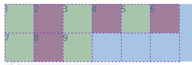
3) z-index
개별 Grid-item에 z-index를 줄 수 있다.
.item:nth-child(5n) {
  z-index: 1;
  transform: scale(2);
  opacity: 0.5;
}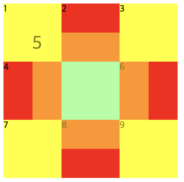
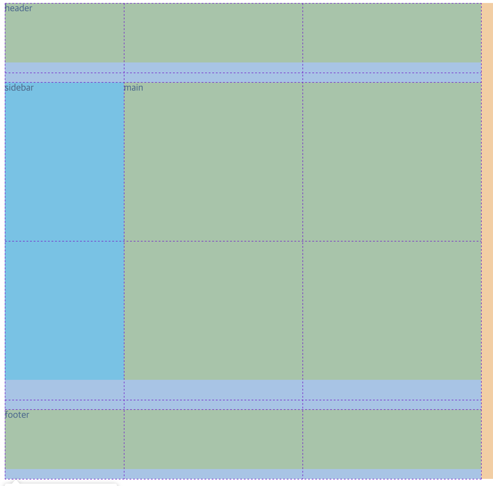
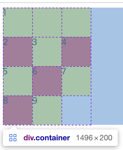
4. grid-template-areas
단순히 영역의 이름을 지정하여 그리드를 정의할 수 있다.
    <div class="container">
      <div class="header">header</div>
      <div class="sidebar">sidebar</div>
      <div class="main">main</div>
      <div class="footer">footer</div>
    </div>
.container {
width: 800px;
height: 800px;
display: grid;
grid-template-areas:
"header header header"
". . ."
"sidebar main main"
"sidebar main main"
". . ."
"footer footer footer";
}
.item {
min-width: 100px;
min-height: 100px;
}
.header {
width: 800px;
height: 100px;
background-color: yellow;
grid-area: header;
}
.sidebar {
width: 200px;
height: 500px;
background-color: aqua;
grid-area: sidebar;
}
.main {
width: 600px;
height: 500px;
background-color: yellow;
grid-area: main;
}
.footer {
width: 800px;
height: 100px;
background-color: yellow;
grid-area: footer;
}